NayaPay Design System 2.0
We worked on building NayaPay’s consumer design system entirely in-house. It includes over 1,000 components, 800+ design tokens, and a solid structure of local and global variables.
The system was built to scale fast, stay consistent, and make life easier for developers.
Team Structure
NayaPay Business & Consumer
Product Designers: 8
My Role
Senior Product Designer II Full-time
Team
Product Design Consumer Squad • 14 people
Scope Design Tokens • Style Dictionary • Component Library • Foundations • Patterns • Accessibility Tags • Documentation • Handoff
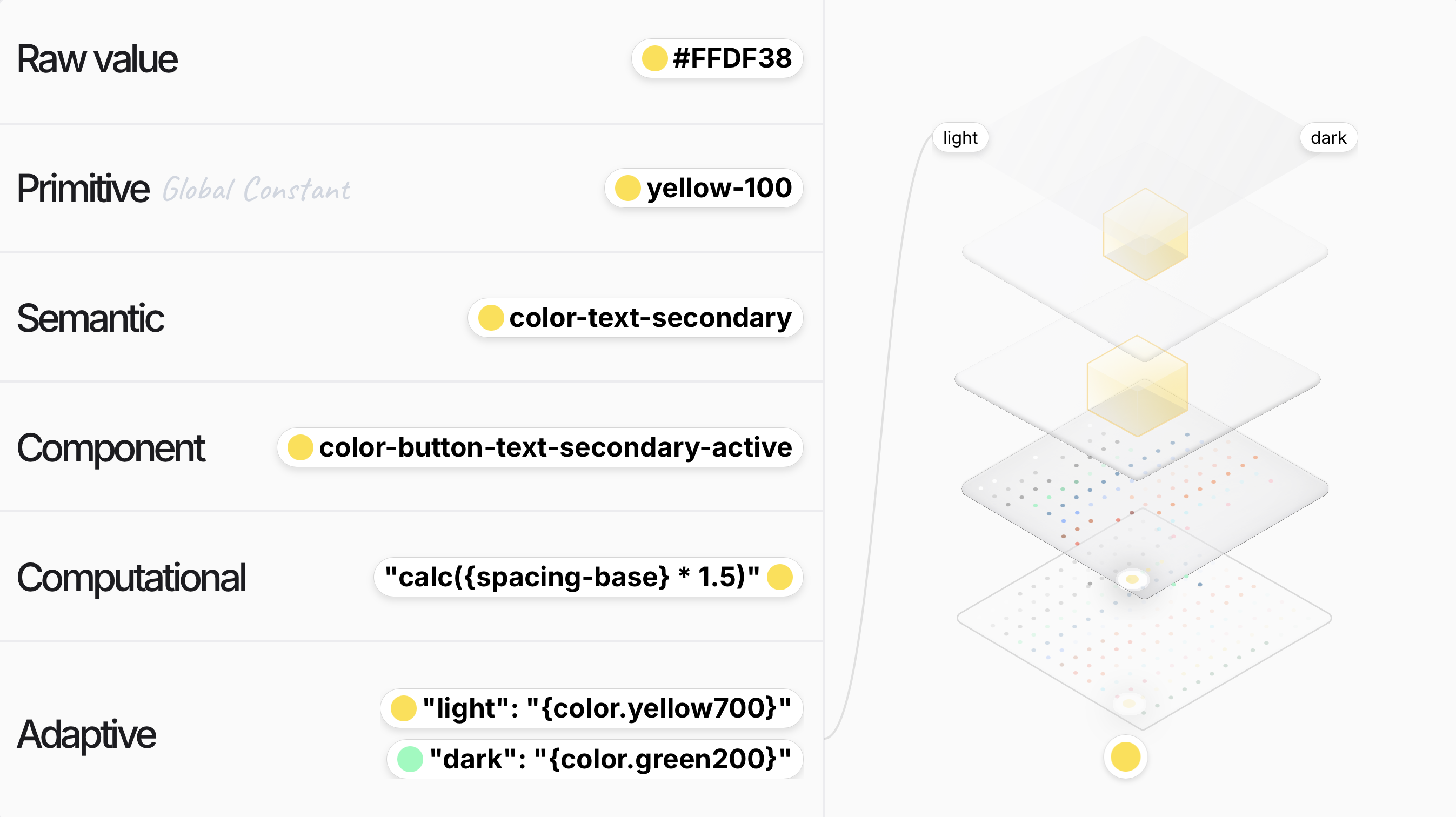
Design Tokens
Think of design tokens like nicknames for your design elements. Instead of using hex codes or pixel values, we give styles simple, readable names that store design details. These tokens connect across platforms like Web, iOS, and Android, making scaling and updates effortless.
They’re the smallest building blocks of a design system, keeping our brand consistent and easy to scale.
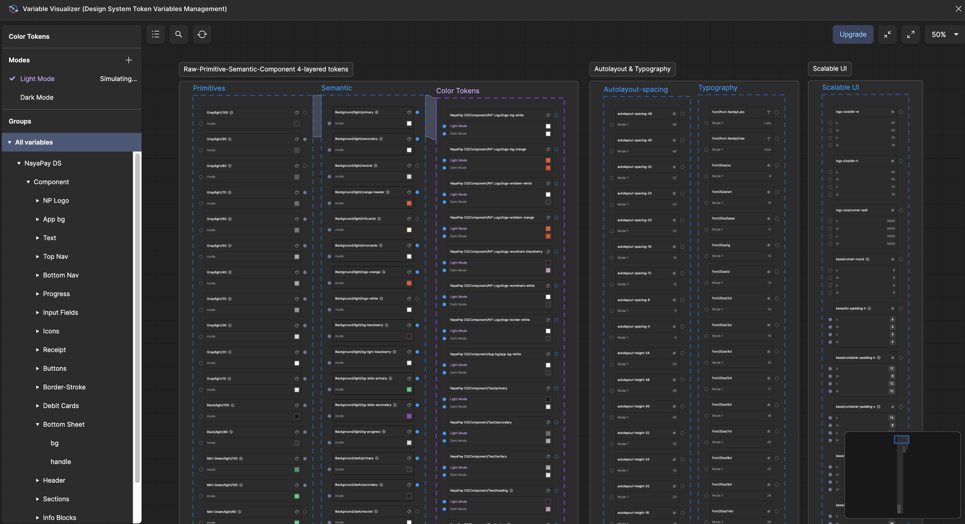
How Tokens Are Created
Instead of manually creating variables and mapping them one by one in Figma, I used the Variable Visualizer plugin to create, organize, and map relationships between tokens. Over 800 variables were built, and they can be previewed live by switching between our selected modes.
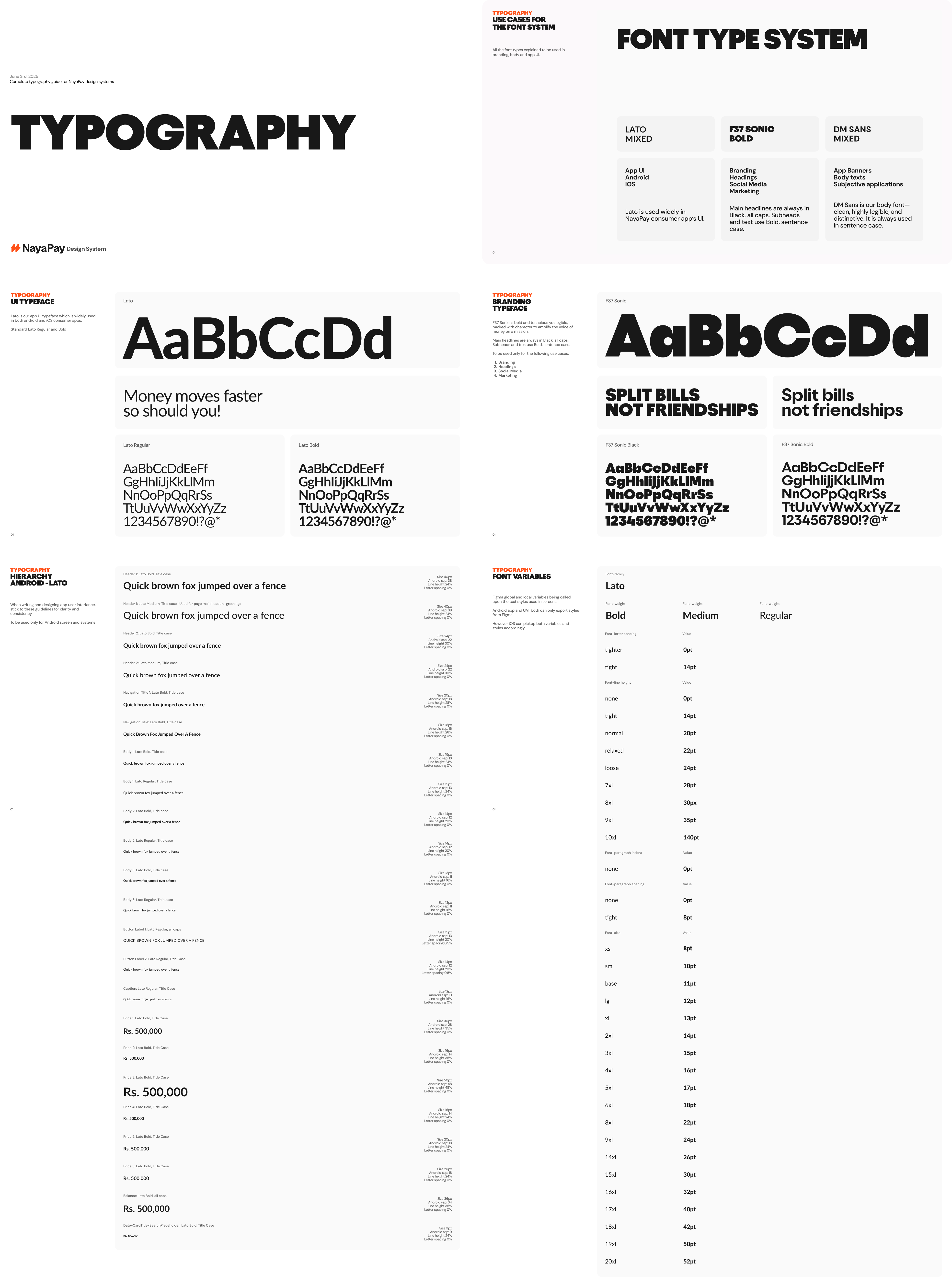
Typography
Our design system uses a mix of expressive and functional typefaces. F37 Sonic represents the brand, giving it a bold and distinctive personality. For the interface, we use Lato and DM Sans to ensure clarity and readability across platforms.
This balance of branding and legibility helps create a consistent and accessible experience for our PMs, Marketing & Dev Teams.
Components and Asset Library
We have built over 400 components for the Consumer design system, and the Business system, still in progress, has already passed 600 components.
Teams can easily access and use these directly from the assets tab in Figma to speed up design and development.
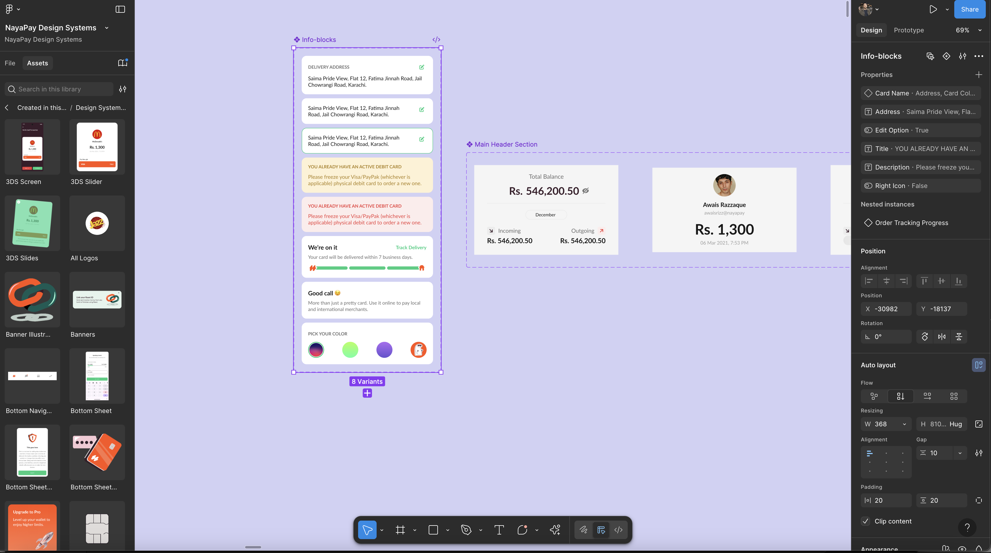
Here’s a preview of components applied to live design files. Most are still a work in progress, with mode and instance switching handled through variables and booleans.
We aim to keep instances to a minimum wherever possible.
For now, this is all I can share publicly, but there is much more behind NayaPay’s design systems.
We’re always refining, experimenting, and building something new. Feel free to reach out for a deeper look into the work that powers our products.
Thanks for stopping by 👋
🕺 Nope, it's not Framer. Neither Webflow. I coded it!